What is a Forex Line Chart
A forex line chart is a type of chart used in the foreign exchange market (forex) that displays the price movements of a currency pair over a period of time. It is created by plotting a single line that connects the closing prices of the currency pair for each time period, such as days, weeks, or months.
In a forex line chart, the x-axis represents the time period, and the y-axis represents the price of the currency pair. Each data point on the chart represents the closing price of the currency pair at the end of the time period. By connecting these data points with a line, the chart provides a visual representation of the currency pair’s price movements over time.
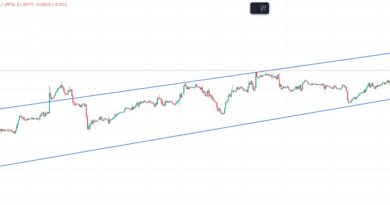
Forex line charts are often used by traders to identify trends and make trading decisions based on historical price patterns. They can also be used in combination with other technical analysis tools, such as moving averages and trendlines, to gain additional insights into market movements.
You should also consider reading our article “Five Hidden Secrets of Line Charts in Forex Trading” here.
Content
How can I start using Forex Line Charts?
Learn to use Forex Line Charts
Pros and Cons of Forex Line Charts
Are there different kinds of line charts?
–Basic Line Chart
–Area Chart
–Logarithmic Chart
–Mountain Chart
–Range Chart
How can I start using Forex Line Charts?
To start using forex line charts, you’ll need access to a trading platform that offers charting capabilities for forex pairs. Many online brokers and trading platforms provide access to charting tools as part of their services.
Once you’ve selected a trading platform, then choose the currency pair you want to analyze. Forex line charts can be used to analyze any currency pair, but it’s important to select the pair that you want to trade or monitor. It could be pairs such as EUR/USD or USD/JPY.
Decide on the time frame you want to analyze, such as daily, weekly, or monthly charts. The time frame you choose will depend on your trading strategy and goals. Navigate to the charting section of your trading platform and select the forex line chart option.
Customize the chart by adding any technical indicators or overlays that you want to use to help identify trends and make trading decisions. Some common technical indicators used in forex trading include moving averages, MACD, and RSI.
Once you’ve customized the chart to your liking, use it to analyze price movements and identify potential trading opportunities. Look for trends and patterns that may indicate potential buy or sell signals.
Then based on your analysis of the chart, make trading decisions that align with your trading strategy and goals.
Learn to use Forex Line Charts
Learn to use line charts in this short video by NFXtrader.
Pros and Cons of Forex Line Charts
Pros
- Simple and easy to understand: Line charts are simple and easy to understand, even for beginner traders. They provide a quick snapshot of price movements over time and can help identify trends and patterns.
- Shows clear trend lines: Line charts can be used to draw trend lines, which can help traders identify potential support and resistance levels.
- Provides a quick overview of price movements: Because line charts only show closing prices, they provide a quick overview of the price movements of a currency pair over a given period.
- Easy to customize: Line charts can be customized to include different technical indicators, overlays, and time frames, making them flexible and adaptable to different trading strategies.
Cons
- Lack of detail: Line charts only show closing prices, which means they lack the detail and precision of other types of charts like candlestick charts.
- No information about high and low prices: Line charts do not show the high and low prices of a currency pair, which can make it difficult to identify important price levels.
- May not show price gaps: Line charts do not show price gaps, which can occur when there is a sudden shift in price between two periods. This can make it difficult to accurately analyze price movements.
- Potential for false signals: Line charts can produce false signals, which can lead to inaccurate trading decisions. This is especially true in volatile markets or when using shorter time frames.
Are there different kinds of line charts?
There are different types of line charts that can be used to analyze financial data, including forex line charts. Some of the most common types of line charts are:
- Basic line chart: A basic line chart is the most common type of line chart, where a single line is used to connect the closing prices of an asset over a given period of time.
- Area chart: An area chart is similar to a basic line chart, but the area between the line and the x-axis is shaded to emphasize the magnitude of price movements.
- Logarithmic chart: A logarithmic chart is a type of line chart that uses a logarithmic scale for the y-axis instead of a linear scale. This can help to better represent large price movements and changes in volatility.
- Mountain chart: A mountain chart, also known as a stepped line chart, is a variation of the line chart where the line is composed of vertical and horizontal segments. This type of chart is useful for emphasizing changes in direction or when there are gaps in the data.
- Range chart: A range chart is a type of line chart that shows both the high and low prices of an asset over a given period of time. The line connects the midpoint of the high and low prices for each time period.
Each type of line chart has its own unique characteristics and can be used to analyze different aspects of price movements. It’s important to choose the type of chart that best suits your trading strategy and goals.
Basic Line Chart
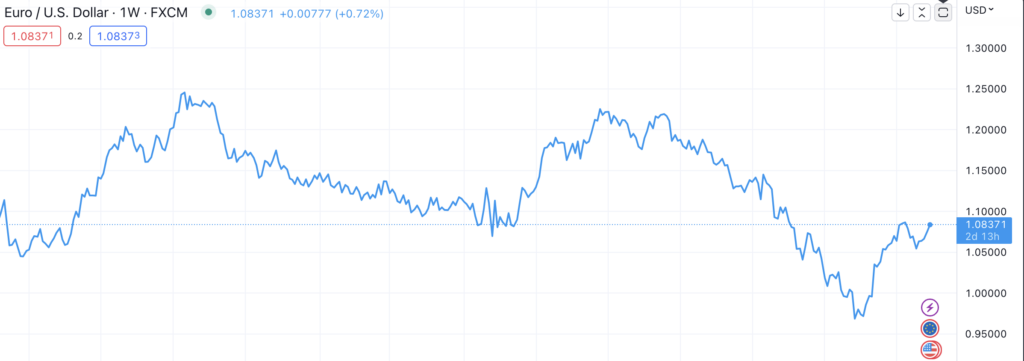
A basic line chart is a type of chart used to display the price movements of an asset over a given period of time. It is created by plotting a single line that connects the closing prices of the asset for each time period. In the context of forex trading, a basic line chart is often used to track the price movements of currency pairs.
In a basic line chart, the x-axis represents the time period, and the y-axis represents the price of the asset. Each data point on the chart represents the closing price of the asset at the end of the time period. By connecting these data points with a line, the chart provides a visual representation of the asset’s price movements over time.
Basic line charts are useful for providing a quick overview of the price movements of an asset and can help traders identify trends and patterns. They are simple to interpret and can be used to create basic trend lines that can help traders identify potential support and resistance levels.
However, one of the limitations of a basic line chart is that it only shows the closing price of the asset, which means that it does not provide information about the high and low prices or the opening price for each time period. As a result, basic line charts may not provide enough detail for traders who need to analyze price movements in more depth.
Overall, basic line charts can be a useful tool for traders who are looking for a simple and easy-to-understand way to track price movements over time. However, they should be used in combination with other technical analysis tools and strategies to make informed trading decisions.
Area Chart
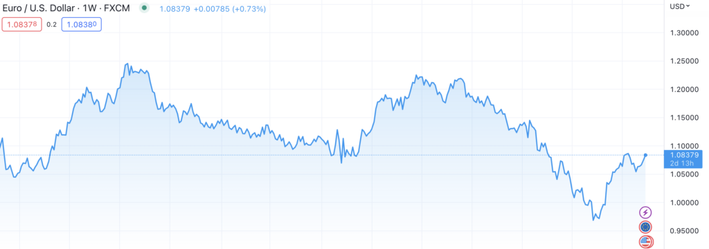
An area chart is a type of chart used in financial analysis that is similar to a basic line chart, but with an added area below the line that is shaded in a different color to emphasize the magnitude of price movements. In the context of forex trading, area charts are often used to track the price movements of currency pairs over time.
Area charts can be useful for forex traders because they provide a quick and easy way to visualize changes in price movements over time. By shading in the area below the line, area charts make it easy to see the degree to which prices have risen or fallen. This can be particularly helpful for identifying trends, support and resistance levels, and potential trading opportunities.
One advantage of area charts over basic line charts is that they provide a clearer indication of the magnitude of price movements. This is because the area below the line is shaded in a different color, which makes it easier to see when prices have risen or fallen sharply.
However, one disadvantage of area charts is that they can be more difficult to read than basic line charts. This is because the shading below the line can sometimes obscure important details, such as individual data points or smaller price movements.
Overall, area charts can be a useful tool for forex traders who are looking for a simple and effective way to track price movements over time. However, they should be used in conjunction with other technical analysis tools and strategies to make informed trading decisions.
Logarithmic Chart
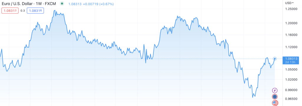
A logarithmic chart is a type of chart used in financial analysis that uses a logarithmic scale for the y-axis instead of a linear scale. In the context of forex trading, logarithmic charts are often used to track the price movements of currency pairs over a long period of time.
In a logarithmic chart, the y-axis is scaled logarithmically, which means that each unit of movement is proportional to a percentage change rather than a fixed amount. This makes it easier to see large price movements over a long period of time, especially when the price movements cover a wide range of values.
Logarithmic charts are particularly useful for analyzing long-term price movements because they can help traders identify trends and patterns that may not be immediately apparent on a linear chart. By using a logarithmic scale, logarithmic charts can help traders identify important price levels and potential support and resistance zones that may be overlooked on a linear chart.
However, one disadvantage of logarithmic charts is that they can be difficult to interpret for traders who are not familiar with logarithmic scales. Additionally, logarithmic charts may not be as useful for short-term trading strategies, where the focus is on smaller price movements over a shorter period of time.
Overall, logarithmic charts can be a useful tool for forex traders who are looking to analyze long-term price movements and identify trends and patterns that may not be visible on a linear chart. However, traders should be familiar with logarithmic scales and should use logarithmic charts in conjunction with other technical analysis tools and strategies to make informed trading decisions.
Logarithmic scales
A logarithmic scale is a type of scale used in financial analysis that measures the quantity being plotted using a logarithmic function instead of a linear function. In contrast to a linear scale, where each unit of movement represents a fixed amount, a logarithmic scale increases by a percentage or multiple of the previous value.
Logarithmic scales are particularly useful when the quantity being plotted covers a wide range of values. By using a logarithmic scale, it becomes easier to see changes in the quantity being plotted at both the high and low ends of the scale. For example, a logarithmic scale might be used to plot the prices of a stock over a long period of time, where the prices may range from a few dollars to several hundred dollars per share.
To understand how a logarithmic scale works, consider the example of a stock price that increases from $10 to $20 over the course of a year. On a linear scale, this increase would be represented by a movement of $10 on the y-axis. However, on a logarithmic scale, the increase would be represented by a percentage increase of 100%, which would be the same as a movement from $10 to $20 on a linear scale that starts at zero.
Logarithmic scales are commonly used in financial analysis to plot a variety of quantities, including stock prices, market indices, and currency exchange rates. By using a logarithmic scale, traders can more easily see changes in the values being plotted over a wide range of values, which can help them identify trends, support and resistance levels, and potential trading opportunities.
Mountain Chart
Mountain charts, also known as stepped line charts, are a type of chart used in financial analysis that are similar to line charts, but with vertical and horizontal segments instead of a continuous line. In the context of forex trading, mountain charts are often used to track the price movements of currency pairs over time.
Mountain charts can be useful for forex traders because they provide a clear and easy-to-read way to track changes in price movements over time. By using vertical and horizontal segments to represent changes in price, mountain charts emphasize changes in direction or when there are gaps in the data. This can be particularly helpful for identifying trends, support and resistance levels, and potential trading opportunities.
One advantage of mountain charts over other types of charts is that they can make it easier to see changes in direction or momentum in the price movements of a currency pair. This is because the vertical and horizontal segments make it clear when the price has shifted upward or downward.
However, one disadvantage of mountain charts is that they can be less precise than other types of charts, such as candlestick charts. This is because the vertical and horizontal segments may not accurately represent the exact price movements between data points.
Overall, mountain charts can be a useful tool for forex traders who are looking for a simple and effective way to track price movements over time. However, they should be used in conjunction with other technical analysis tools and strategies to make informed trading decisions.
Range Chart
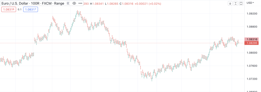
A range chart is a type of chart used in financial analysis that displays both the high and low prices of an asset for each time period, as well as a line connecting the midpoints of the high and low prices. In the context of forex trading, range charts can be used to track the price movements of currency pairs over a given period of time.
Range charts can be useful for forex traders because they provide a clear and easy-to-read way to track the price movements of a currency pair. By displaying both the high and low prices for each time period, range charts provide a more detailed picture of the price movements than other types of charts, such as basic line charts.
Range charts can be particularly useful for identifying support and resistance levels. For example, if the price of a currency pair repeatedly bounces off a certain price level, that level may be considered a support level. Similarly, if the price of a currency pair repeatedly fails to break through a certain price level, that level may be considered a resistance level.
However, one disadvantage of range charts is that they can be less precise than other types of charts, such as candlestick charts. This is because the range chart only displays the high and low prices for each time period, and does not provide information about the opening or closing prices.
Overall, range charts can be a useful tool for forex traders who are looking for a detailed and easy-to-read way to track the price movements of a currency pair. However, traders should use range charts in conjunction with other technical analysis tools and strategies to make informed trading decisions.

